gamersclub · Redesign Case Study

3 weeks, 1 event, and a home nobody was using

A full home redesign for Brazil's largest competitive gaming platform, shipped in 3 weeks. Making it appealing to our users and detailing all the interactions and user feedback.

10×Time on page
0% → 50%Reached the end of the page
74NPS of the new home
88%Said ads didn't hurt the experience
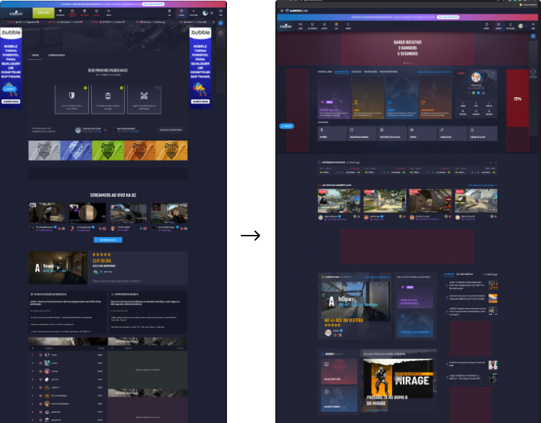
GamersClub home: before and after the redesign
quick_reference_all Overview
Context

A home page that was just a hallway

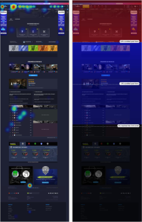
The heatmap said it all: interaction stopped at the header menu.

About less than 20 users a day visited and scrolled the home, mostly to screenshot the ranking or hunt for the anti-cheat download buried at the bottom. Ads filled both side rails, every section had the same visual weight, and nothing below the fold earned attention.

RoleProduct Designer (Senior) + Research OPS
FocusUX&UI, Information Architecture, Research and Research OPS
CollaboratorsProduct, Stakeholders, Engineering
Timeline3 weeks | 2023
The Challenge

3 weeks, with an event coming

A major event was coming, with an activation strategy converting free users into paying customers. The home would be the first contact for the new wave.
Deadline: 3 weeks, shipped. With that timeline, the obvious move was a visual facelift.

My role

From research to handoff

Solo on design, research and research OPS.

The PM ran the same prioritization interview with stakeholders in parallel, so we could cross both perspectives and build the correlation matrix together.

quick_reference_all Research

1. Fast research is not shallow research

What the data said: heatmap concentrated on the header menu. ~20 users a day on the page.

Why: I asked my Research OPS base, 60+ engaged users on Discord, no incentive, answers in hours. They only opened the home for two things:

  • Screenshot the ranking to share it
  • Find the anti-cheat, to download the first time or update it. Discovered by accident at the bottom of the page

Everything else: straight to "Play." The home wasn't part of anyone's routine.

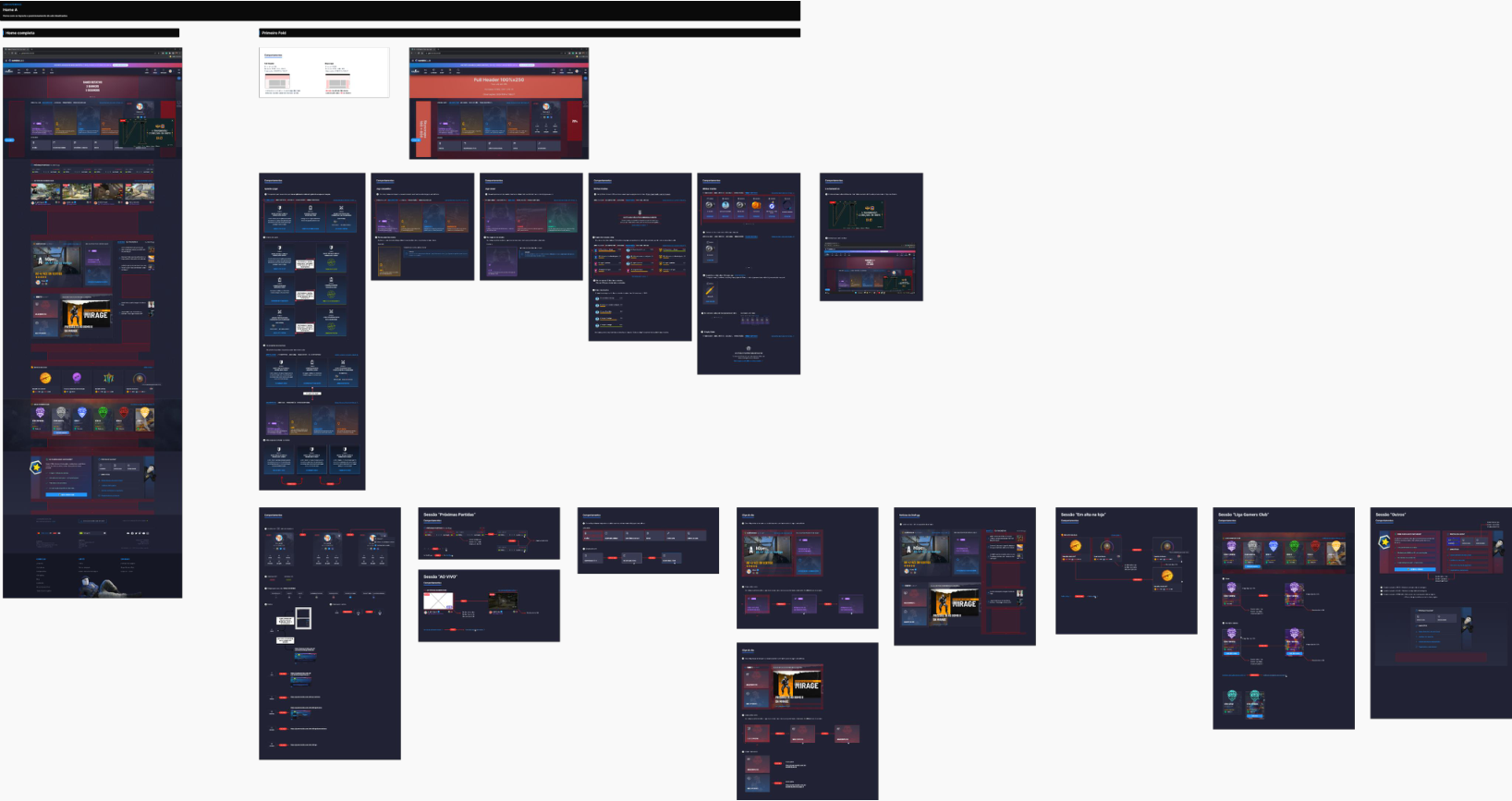
Old home pages
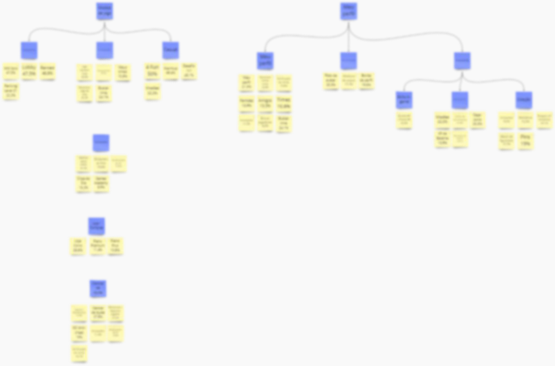
Product architecture map

2. Mapping what users actually did

Instead of asking "what do you want to see on the home?", I mapped the product's entire architecture: every page, what it offered, and how often users looked for it.

  • Game modes dominated: MM Solo (47.5%), Lobby (47.5%), Ranked (46.8%). What users came to do.
  • Profile was social: match history, friends, notes.
  • Help Center demand was huge: Support (31.6%), Help Center (27.8%), Anti-Cheat (19%).

*In competitive gaming, support is part of the loop (reporting cheaters, appealing bans), not product friction.

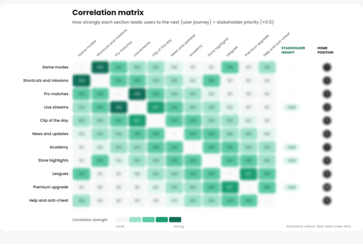
3. The correlation matrix

I crossed two perspectives, with different weights:

  • Users: which pages naturally connected to which others in their journey
  • Stakeholders (via PM): what the company wanted users to discover and convert, weighted +0.5

The matrix ordered the home not by intuition or internal politics, but by where each element would take the user next:
a journey with rhythm, from the top of the page to the end.

Correlation matrix
The strategic decision

The Help Center is one of the most searched sections of the product. I placed it at the very end of the page. On purpose.

Users search for it with intent: they'll scroll to find it wherever it is. At the end, that intent carries them through all the content in the middle. More sections discovered, more ads seen. Intentional friction, serving monetization, without breaking the user's goal.

lightbulb_2 The solution

A home with rhythm, and components built to last

Each section earns the next scroll: what users came for at the top, discovery in the middle, intent-driven content at the end. Ads placed along the journey instead of competing with it.

And I had the freedom to propose new components but with that I had to detail every interaction and journey

New home components and interactions
monitoring Business impact

Results

Two months after launch, a deskresearch and a survey confirmed the change held:

0% → 50%Now reach the end
<12s → 2minTime on page, 10×
100%Of event signups through the home
88%Rated the home as useful
88%Said the ads didn't hurt the experience
CSAT 90%Excellent in any product benchmark

What I'd Do Differently

lightbulb_2

Define the business metrics before launch.

I solved the engagement problem, but never instrumented the financial return: ad impressions, page revenue, conversions attributed to the home. Today, on any project touching monetization, I define those metrics with PM and data before launch, not after. Engagement validated the experience. Business return would have closed the loop.

What I learned from this project

recenter

Research OPS is a speed asset.

The 60+ user base didn't exist by luck. Building research infrastructure before you need it is what makes 3-week timelines survivable.

handshake

Order is a design decision.

The same sections in a different sequence produce a different business result. Architecture is invisible craft.

compare_arrows

The best placement isn't always the most convenient one.

The Help Center at the end serves the user who searches with intent and the business that needs the journey. Both, on purpose.

alt_route

Instrument before you launch.

The metric you don't configure is the impact you can't claim.

work Next Case Study
gamersclub · Innovation Case Study

Asked to cut costs, I built a revenue channel

A research ops redesign for a Brazilian gaming platform, where the real problem wasn't the survey tool: it was why anyone answered at all.

Research OPS New B2B Revenue Customer Center
+14xResponse rate
~R$0Build cost
View case study
GamersClub Missions page on a laptop